-
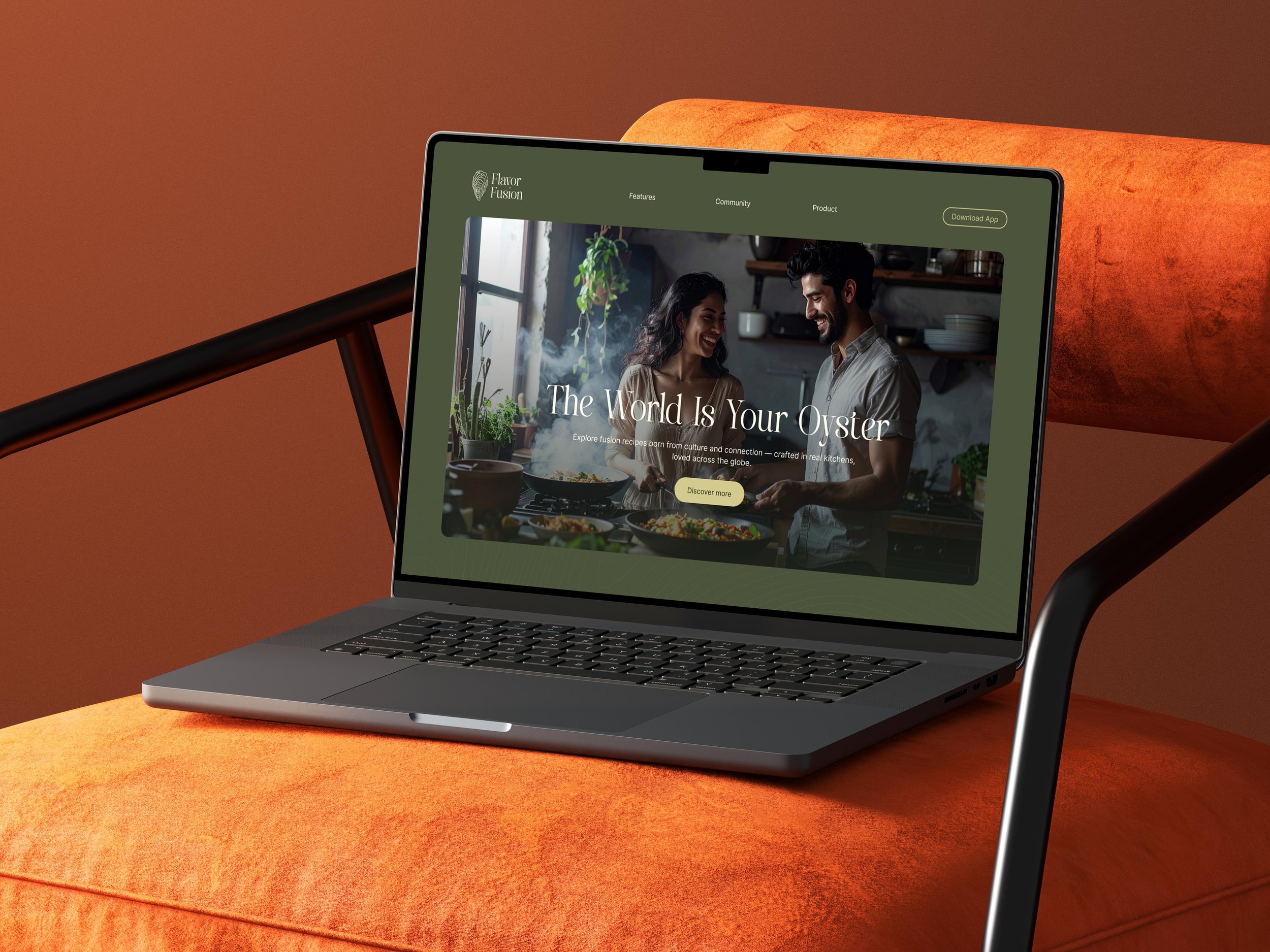
As part of the UX/UI Design Bootcamp, I developed a high-fidelity prototype for a landingpage to promote the launch of a recipe app called FlavorFusion.
-
Communicate FlavorFusion's core benefits and highlight its unique features.
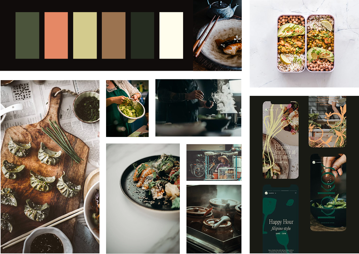
Create an engaging visual design using appetizing colors, imagery, and typography.
Design an intuitive, user-centered layout with essential info above the fold.
Optimize for conversion with strong CTAs and user-generated content.
-
Deliverables included a hi-fi desktop prototype, process wireframes, a style guide with design principles, color palette, typography, and tone of voice, as well as a component library and all necessary assets for development.
All completed within 2.5 days.
User Persona
Fiona Foodie
35, architect, single, based in Berlin
As a hobby cook, I’m always looking for quick, creative, and international recipes to expand my culinary skills, surprise friends, and keep my cooking routine exciting. I also enjoy sharing my own recipes and connecting with other food lovers, as being part of a vibrant community is important to me.
Her Painpoints & Needs
She wants everyday recipes with an international twist and finds most platforms too repetitive. Personalized suggestions based on her taste or ingredients at home are important to her. She also values easy-to-save shopping lists, the ability to share her own creations and get feedback, and connecting with food lovers worldwide for fresh inspiration.
Type & Logo
I chose Emofera as an expressive display font. It adds a sense of cultural depth and emotional warmth to headlines and key brand moments.
Inter, by contrast, ensures clarity and readability across all digital interfaces. As a modern, versatile sans-serif, it keeps the overall experience clean, accessible, and user-friendly.
The oyster serves as FlavorFusion’s key brand symbol. It embodies the core idea: a world of hidden culinary treasures, waiting to be discovered through food. As a subtle nod to the phrase “The world is your oyster,” it represents openness, possibility, and cultural richness.
Moods & Colors
User Flow
Entry Point
User lands on the homepage (via link, search, QR code, etc.)
Hero Section
App name & logo
Large headline + subline introducing the app
Short paragraph with 2–3 key benefits
Primary CTA: “Discover More” or “Download App”
Optional: QR code for quick mobile access
USP Section & Features
3 USPs
3 Key Features
Social Proof Section
Horizontal scroll element showcasing 3–4 user reviews/testimonials
Designed to build trust and credibility
Download/CTA Section
Prominent call-to-action area with:
“Download Now” button
App mockup visual and/or QR code for direct download
